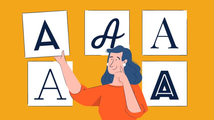
You can get every font type, from sans serifs to elegant scripts. An incredible variety of typography is out there, just waiting to be explored. Whether you’re a designer, writer, or someone who loves beautiful letterforms, understanding the different typefaces can greatly enhance your creative projects. This blog post will dive deep into different fonts styles, comparing and contrasting their unique characteristics.
Different fonts styles:Typefaces
Typefaces play a crucial role in shaping any text’s overall design and message. With numerous options available, choosing the right typeface for your project can be overwhelming. Understanding the different types of typefaces can help you make an informed decision.
Serif fonts
Serif fonts are characterized by small lines or strokes at the ends of each letter. They exude a traditional and elegant feel, making them popular for printed materials like books and newspapers.
Sans Serif fonts
In contrast to serif fonts, sans serif fonts do not have those decorative lines or strokes at the ends of letters. This gives them a more modern and clean appearance, making them suitable for digital content like websites and presentations.
Display fonts
Display fonts are attention-grabbing and often used for headlines or large titles due to their unique designs. They come in various styles, from bold and blocky to intricate and playful.
Script fonts
Script fonts mimic handwriting with fluid strokes that connect letters seamlessly. These elegant typefaces add a touch of sophistication to invitations, logos, or branding materials.
Slab Serif fonts
Slab serif fonts have thick, rectangular serifs, giving them a strong presence on print and digital platforms.
They are often used when a bold statement is needed but still want to maintain readability. By understanding these different types of typefaces, you can effectively convey your message while creating visually appealing designs explicitly tailored to your needs.
What Makes a Good Typeface?
When it comes to typography, a good typeface can make all the difference in conveying your message effectively. But what exactly makes a typeface “good”? Let’s explore some key factors.
Legibility
Buying a font license is paramount, and you can buy font from a typetype foundry. A suitable typeface should be easily read, whether in print or on a screen. The letterforms should be clear and distinguishable from one another, with enough spacing between characters for comfortable reading.
Versatility.
A good typeface should adapt well to different sizes and contexts without losing its readability or visual appeal. It should work equally well as body text or as headlines, allowing for flexibility in design.
Aesthetics
It also plays a crucial role in determining the quality of a typeface. While personal preferences may vary, certain characteristics tend to make a typeface visually pleasing: balanced proportions, harmonious curves, and consistent stroke widths are just a few examples.
Functionality
A good typeface needs to function across various platforms and devices seamlessly. It should render accurately on screens of different resolutions and maintain its integrity when printed at various sizes.
Conclusion
As we end this exploration into popular typeface varieties, it’s clear that typography plays a crucial role in design and communication. Each typeface category has its own unique characteristics and purpose, catering to different styles and contexts.

